Website comparison
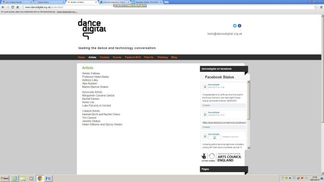
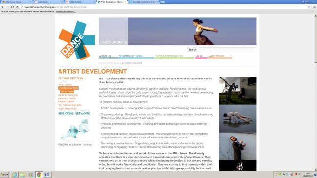
Here are my two examples of Dance organisations web pages. In my opinion the first web site is a very poor web site. Both sites are aimed at similar target audiences which are people interested in dance in each companies specific region. Both companies approach to their web pages have quite similar in ways, i.e. web site layout but the end results are quite different
There are no images at all on the page which for a visual arts company I think is pretty rubbish.
The use of social media in the form of the face book feed on the right hand side is a nice touch but the two logos along the top for face book and twitter look awkward placed and too small for the purpose. The email address below this also looks very out of place. I also think the logo design is poor. The fact it is absolute black over absolute white means the contrast is far too harsh and makes it pretty horrible to look at.
I also think the way the end of the ‘G’ coming down the page finishes very abruptly and this would be far more effective if it linked with the black strip running across the page although this is a kind of dark brown grey colour makes the page look mismatched.
The grey border around the main area of the page makes this site look half hearted and even quite dated. All of the fonts on this page are different fonts and if you put this with the font colour being different on a lot of the headings this makes all the text look once again very mismatched and once unfinished.
I personally think the second web site is a far more attractive and professional looking page. Even though it uses a lot of different colours this has been done in a way to make the site look bright and colourful and all together complete. This is also mirrored in the logo design which uses a few different bright and complimentary colours.
I think the overall layout is similar to the previous with the different columns although far more effective in the result. The use of the banner/header image along the top is a nice visual and great way to utilise space which would otherwise be empty. The image is also reflective of the colours used on the rest of the site.
I also like the use of the images on the right which give a taste of what the company does. This along with the graphic on the left hand side of the page make the page itself seem full and informative and that is before you even read any words.
I like the use of bold text and bullet points too as this means the information is a lot easier to digest. The charcoal grey font colour means the contrast is less rough on the eye but it is still clear enough to easily see and read through the information.
Sources;
http://www.dancedigital.org.uk/production/
http://www.dancesouthwest.org.uk/what-we-do/artist-development
02/07 Presentation, Preparation
recap “Interactive media design… and task 3 was for us to produce a web site, the emphasis being on the designer/client relationship and the production process.”
This week we have been working on producing a presentation, detailing our work, branding and our ideas to date…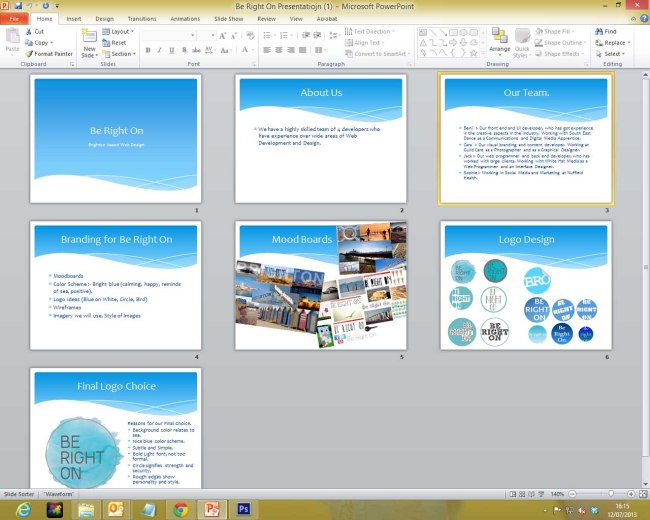
As you can see we have been looking at the imagery we want to use, our logo design and also how we want to be seen.
We have decided on a final logo design, (see the last slide).
We will present this presentation next week for the class…
25/06 Production of a Webstite…
Today we received our new Unit titled, Interactive media design… and task 3 was for us to produce a web site, the emphasis being on the designer/client relationship and the production process.
We all split in to small groups of 4 and were asked to design a ‘showcase’ of our portfolios of work from another task.
Our group named ourselves BE RIGHT ON and for the rest of the lesson we looked at the look and feel of our website including what we would take inspiration from and what we wanted to do. We looked into some previous student work and spent the rest of the lesson creating a mood board to best show what, visually we where going for…
here is my mood board…
College day one
This week, looking at colours with design in mind…
The most basic colour wheel comprises of the 3 primary colours; red, blue, yellow.
secondary colours are when you mix two primary together…
orange = red+yellow
purple = red+blue
green = blue+yellow
Tertiary colours are when you mix a primary and a secondary colour together. for example red-orange.
Black and White are different from other colours as they are not in fact classed as colours…
White or light is seen as the absence of colour i.e. a blank canvas or scientifically white is all the colours of the colour wheel mixed together.
Black is the absolute absence of light and as colour is light… black is not a colour.
Using colours together and colour harmony
when using colours together you have to be very careful not to make your designs look garish or over the top. Here are some basic guidelines you can follow;
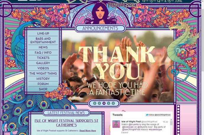
Multi-Coloured
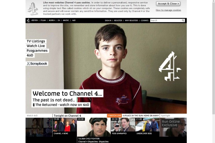
here is an example of a web site with a multi-coloured colour scheme…
Complementary colours are colours which appear at absolute opposite ends of the colour wheel.
here is an example of a web site with a complementary colour scheme, blue and orange being complimentary…
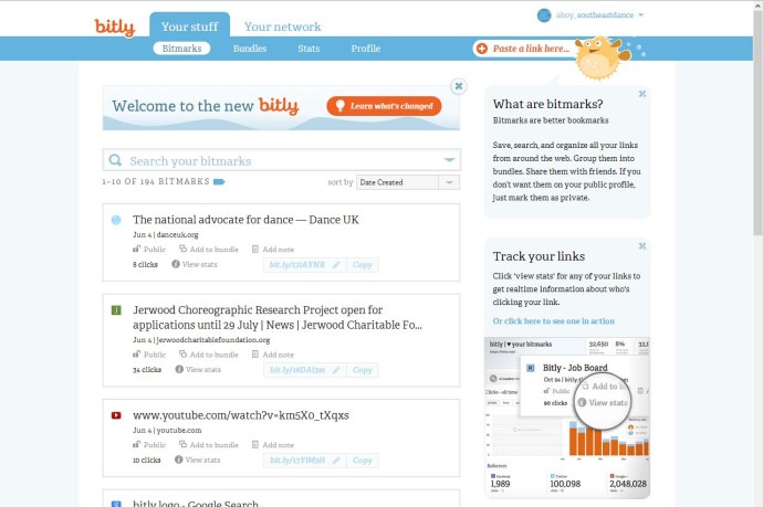
Monochromatic colours are all the different shades of a single colour.
here is an example of a web site with a monochromatic colour scheme…
these are all just guidelines but if you bear them in mind they can be very helpful when putting together a colour scheme for a web page or design.
